New York Foundation is one of the oldest organizations funding grassroots organizing in the country. Today, it backs community organizing and advocacy groups across all five boroughs of NYC, working toward racial, economic, gender, and climate justice.
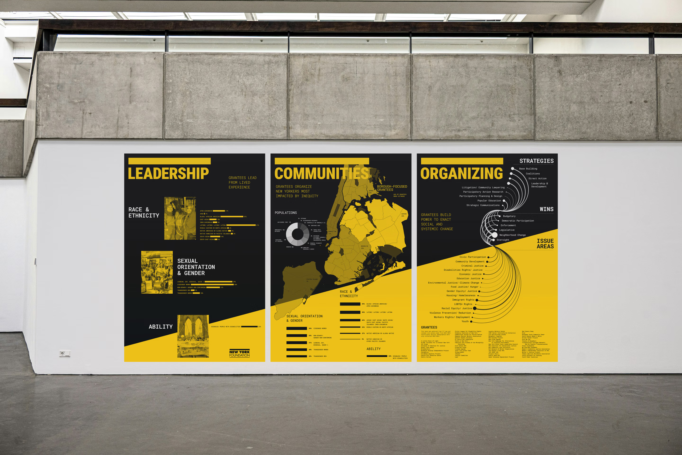
The foundation commissioned a set of large-format posters for its office, which should express its strong impact in communities through grantee demographics and data.
The foundation commissioned a set of large-format posters for its office, which should express its strong impact in communities through grantee demographics and data.


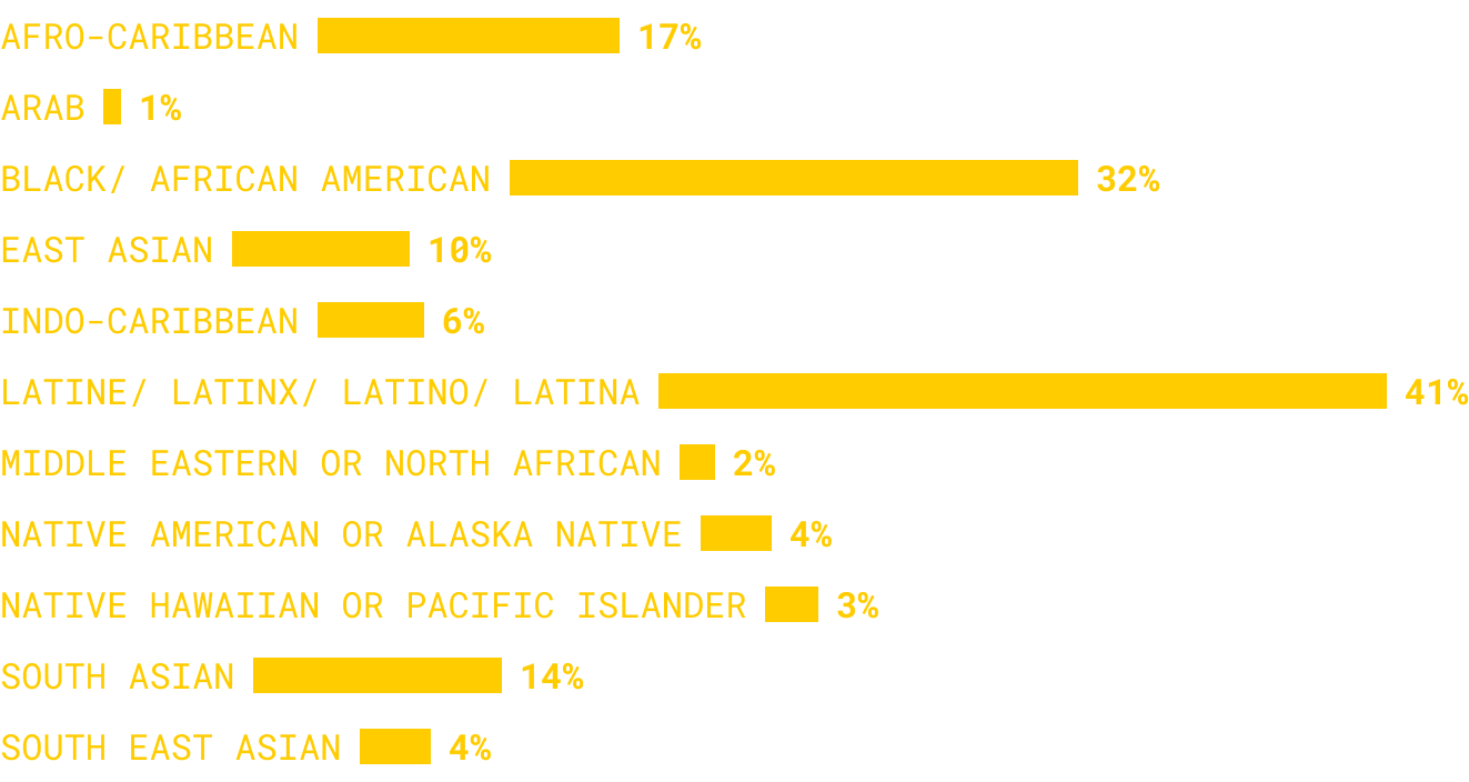

The visual identity had to match the tone of the organization it represents: bold, unapologetic, built for impact. The solution was to adopt black and yellow only, in high contrast, with no extra elements.
To show positive impact and create unity across the three posters, each is cut by a single diagonal. Together, the three form a visual signal of upward, compounding change. The visual elements come straight from the NYF logo, where a heavy bar and a light bar frame the typography. That same contrast runs through charts and hierarchy in the posters.
To show positive impact and create unity across the three posters, each is cut by a single diagonal. Together, the three form a visual signal of upward, compounding change. The visual elements come straight from the NYF logo, where a heavy bar and a light bar frame the typography. That same contrast runs through charts and hierarchy in the posters.


Two charts do the heaviest lifting. The donut chart makes the range of communities NYF's grantees organize, low-income New Yorkers, immigrants, survivors of violence, formerly incarcerated people, legible in a single glance.
The network diagram goes further: it draws direct lines from strategy to win to issue area, showing not just what NYF's grantees do, but how that work moves through to real, systemic change. A whole theory of change, compressed into one image.
The network diagram goes further: it draws direct lines from strategy to win to issue area, showing not just what NYF's grantees do, but how that work moves through to real, systemic change. A whole theory of change, compressed into one image.