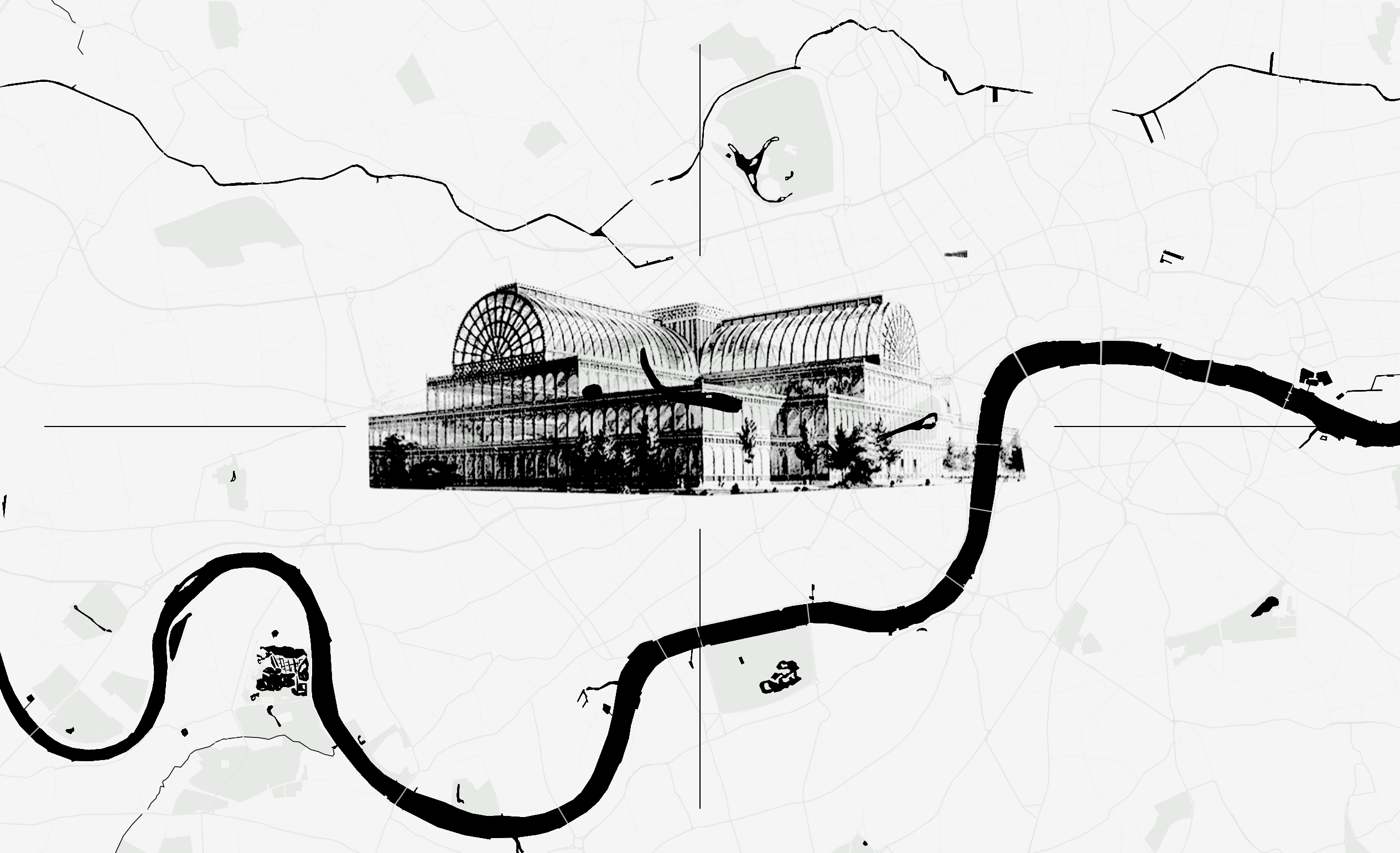
We can hear about Charles Darwin, and we know things about Queen Victoria. But we don't always notice they were living close by at some point. And in the middle, one could cross paths with Karl Marx, William Morris, or Charles Dickens. Those characters, among thirty notable figures, were part of the same scenario, and could plausibly have met while visiting the Great Exhibition at the Crystal Palace.
This project put the pieces together, overlapping singular stories, to illustrate what was being discussed and produced in London in the effervescent year of 1851. To find this focus, the project began with a corpus analysis of eighty-five readings assigned across a course on museums and design history. Names, places, and years mentioned across the readings were extracted and counted to surface a bias, the design history canon returns again and again to a narrow cluster of names, while the actual population of London in 1851 was far larger and more varied than the readings suggest. That asymmetry became the argument for the piece.
This project put the pieces together, overlapping singular stories, to illustrate what was being discussed and produced in London in the effervescent year of 1851. To find this focus, the project began with a corpus analysis of eighty-five readings assigned across a course on museums and design history. Names, places, and years mentioned across the readings were extracted and counted to surface a bias, the design history canon returns again and again to a narrow cluster of names, while the actual population of London in 1851 was far larger and more varied than the readings suggest. That asymmetry became the argument for the piece.

After the argument is set, the story moves into three chapters, grouped less by chronology than by role. "1 The Crystal Palace, the fair, and its believers" opens with the people who built, colored, or refused to enter the building itself. "2 The working city" follows with the engineers, editors, and economists working within an hour's walk of Hyde Park, extending, narrating, or quietly undermining the same industrial confidence. "3 The edges" closes with the figures writing from Chelsea and the suburban hills, the counter arguments to the Exhibition, including one who was still a teenager. Each chapter unfolds one life at a time. Scrolling reveals a portrait, a lifespan bar set against the fixed 1851 origin, and a short account of what that person was doing, thinking, or refusing to do that year, grouped by field and role in history, before the reader reaches the fully interactive map to keep exploring on their own.
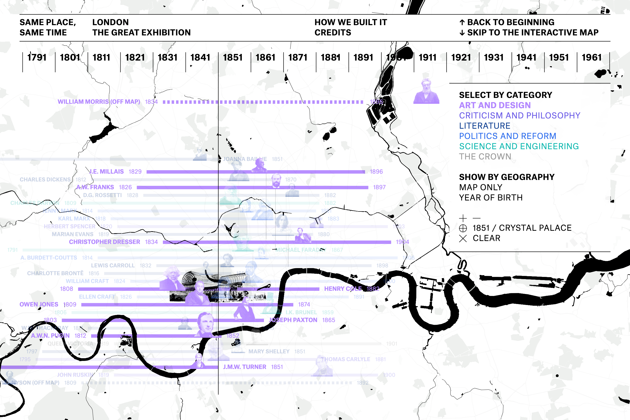
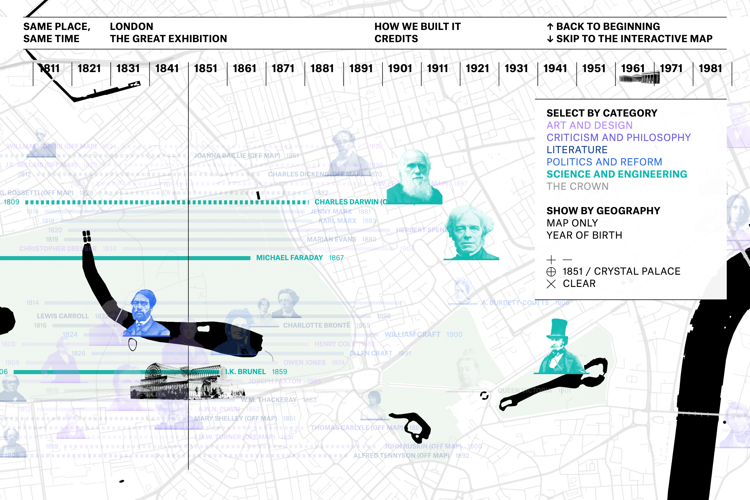
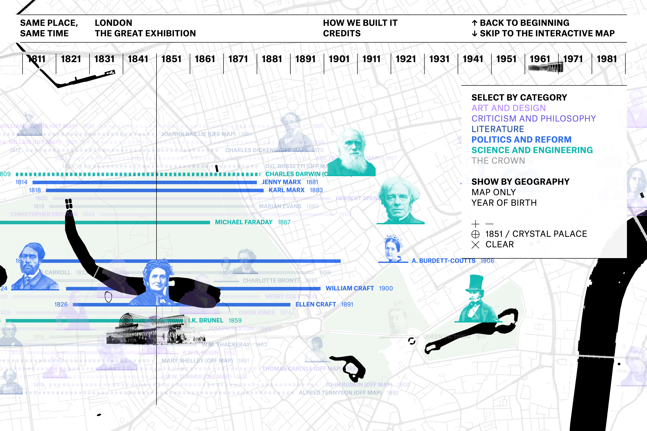
The three chapters end, and the same map becomes fully interactive. What was a fixed scroll turns into a canvas the reader controls, dragging, zooming, and clicking replace the guided sequence. Every figure stays colored by field, and can now be selected one by one or by category, isolating art and design, criticism and philosophy, literature, politics and reform, science and engineering, or the crown, to see how a single discipline responded to the Exhibition on its own terms.
Hovering any portrait surfaces its details, and clicking any name, bar, or portrait opens the same comparison used in the chapters, except the reader now chooses the pair. The view can also recenter on the origin, on 1851, or on the Crystal Palace itself, letting the fixed point that structured the whole narrative double as a navigation anchor once control passes to the reader.
Hovering any portrait surfaces its details, and clicking any name, bar, or portrait opens the same comparison used in the chapters, except the reader now chooses the pair. The view can also recenter on the origin, on 1851, or on the Crystal Palace itself, letting the fixed point that structured the whole narrative double as a navigation anchor once control passes to the reader.
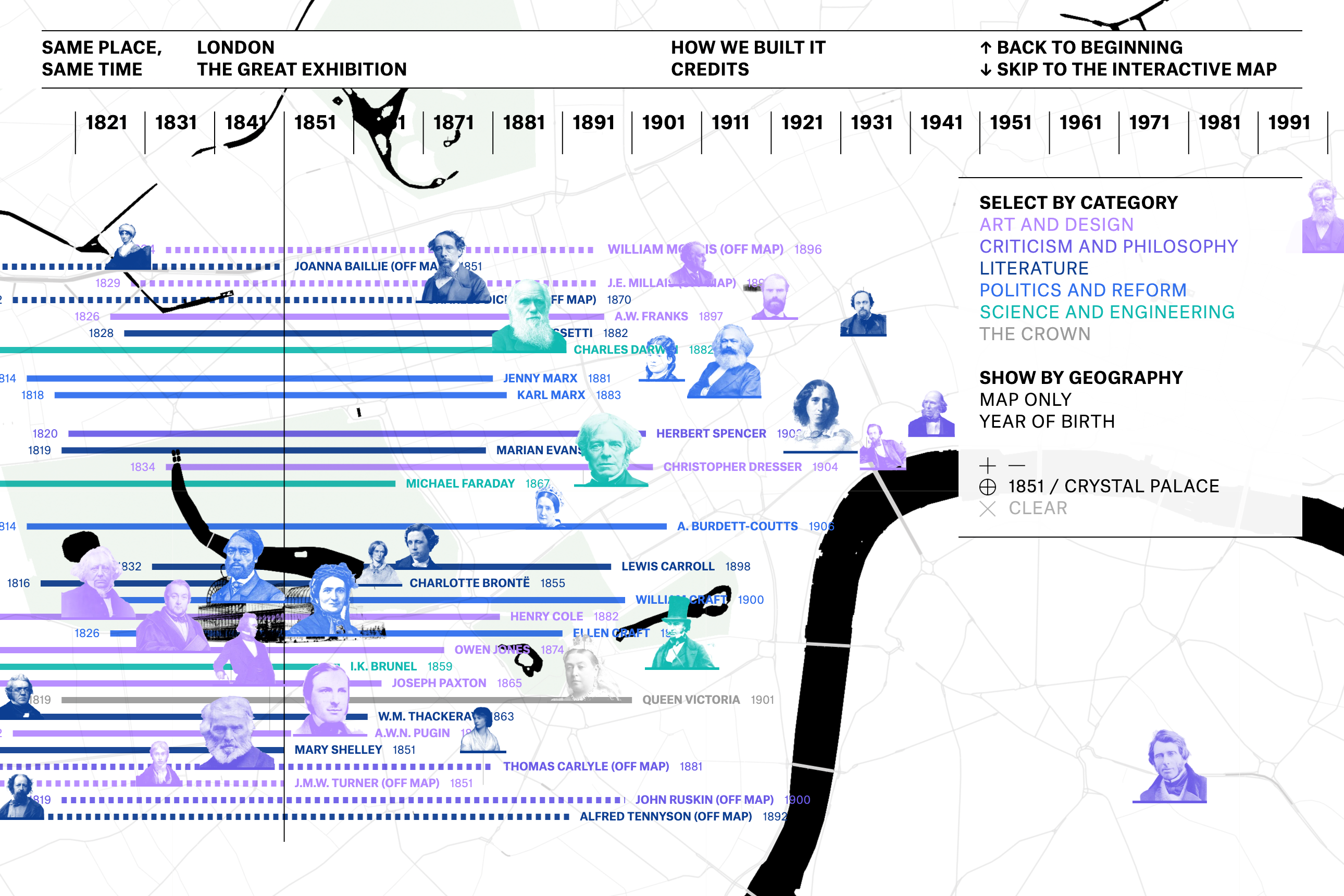
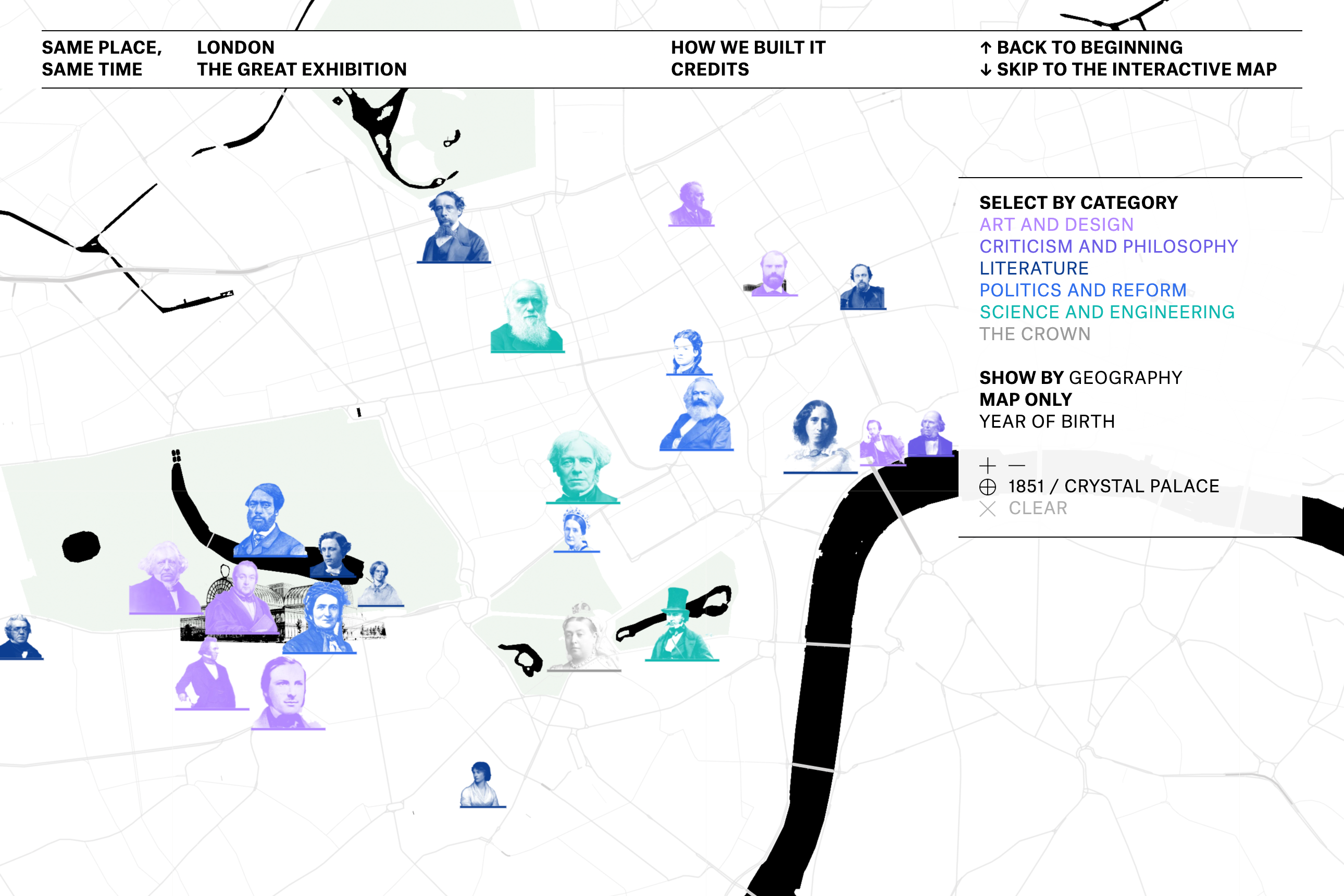
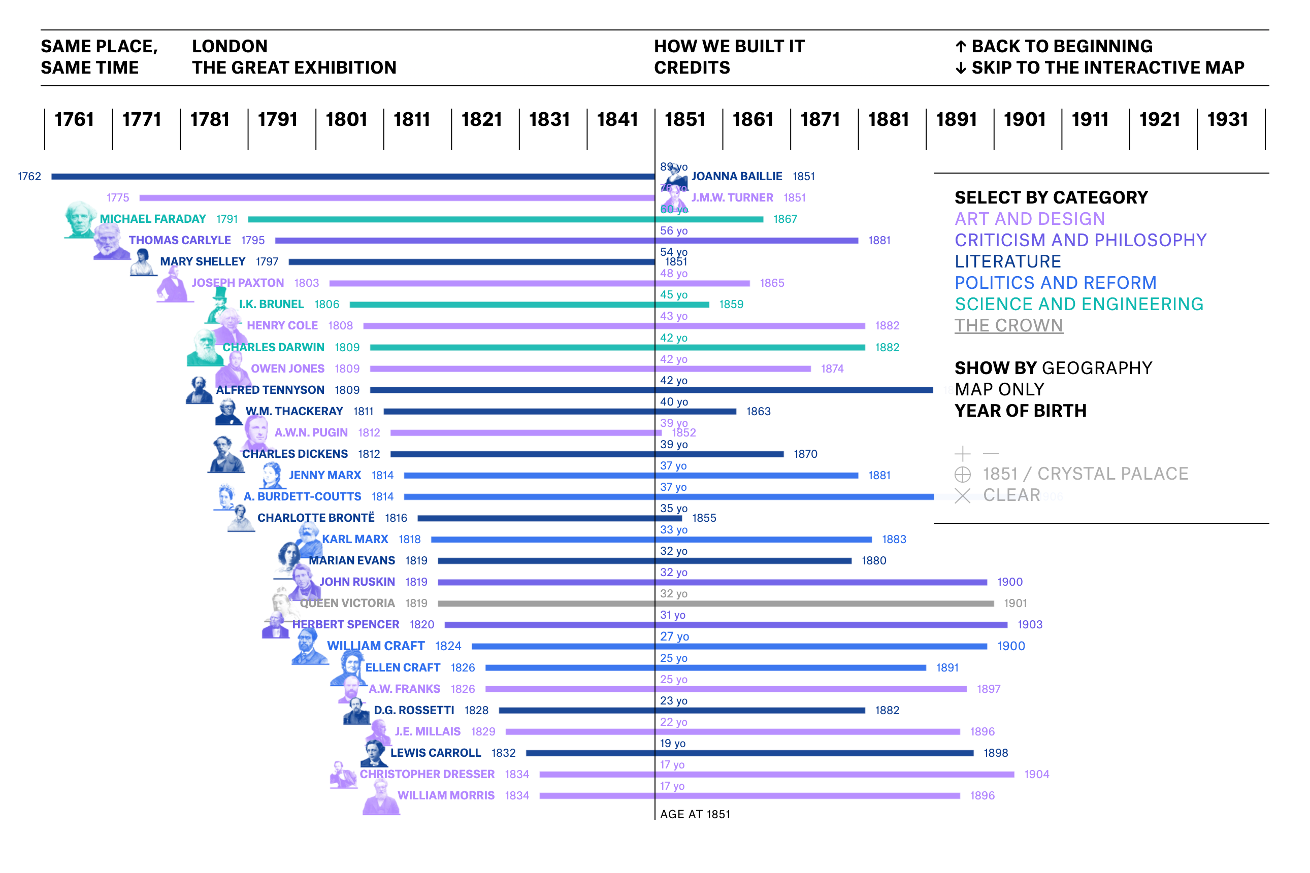
The same thirty figures can be arranged three different ways. Geography keeps both axes active, latitude on one, time on the other, so a figure's position reflects where they stood in London and when. Map only drops the time axis and shows the pins on an ordinary geographic map, useful for reading proximity on its own, independent of any date. Year of birth reorders the same figures along the timeline by the year each one was born, rather than by their fixed 1851 position. The dataset stays the same, but the view turns generational: who came of age together, who was already an old name by 1851, and who had not yet been born when the Exhibition opened.
The interactive timeline-map and its storytelling are the result of a systematic analysis of the eighty-five assigned readings from the syllabus of the class Pratt in London: Design and Museums on Site. The material was programmatically converted to plain text and analyzed, cross-referencing the data in search of insights: names, places, years, and recurring expressions were identified, extracted, and counted across the corpus. William Morris was the most quoted name, appearing in sixteen of the readings; the V&A and the British Museum were the most cited places; and 1851 caught the attention, flagged as a key date by fourteen readings, more than any other year, with fifty-two mentions in all. Nineteen of the thirty figures on the map are named at least once in the readings.
The insights from this analysis set the topic that conducts the narrative: a photograph of one time and one place, and everything that was happening inside it, narratives that occasionally cross, and stories with no direct connection at all. After being designed in Figma, the website was built with the support of Claude and Claude Code. Every location was verified against a primary or documentary source: the 1851 census, English Heritage blue plaques, diaries, or letters. Figures without a confirmable London address in 1851 appear as visitors at documented locations or were left off entirely. No approximate addresses were accepted.
The final product is a single HTML file (plus the Leaflet library and map tiles, loaded at runtime), published with GitHub Pages. The map runs on Leaflet, with a custom base style built in Mapbox Studio on OpenStreetMap data. The timeline is drawn as SVG from the same dataset, and the portraits are period images sourced from Wikimedia Commons and embedded in the file. The AI assisted with corpus analysis, research retrieval, drafting, and code. The topic, the argument, the design, and the writing are the author's.
The insights from this analysis set the topic that conducts the narrative: a photograph of one time and one place, and everything that was happening inside it, narratives that occasionally cross, and stories with no direct connection at all. After being designed in Figma, the website was built with the support of Claude and Claude Code. Every location was verified against a primary or documentary source: the 1851 census, English Heritage blue plaques, diaries, or letters. Figures without a confirmable London address in 1851 appear as visitors at documented locations or were left off entirely. No approximate addresses were accepted.
The final product is a single HTML file (plus the Leaflet library and map tiles, loaded at runtime), published with GitHub Pages. The map runs on Leaflet, with a custom base style built in Mapbox Studio on OpenStreetMap data. The timeline is drawn as SVG from the same dataset, and the portraits are period images sourced from Wikimedia Commons and embedded in the file. The AI assisted with corpus analysis, research retrieval, drafting, and code. The topic, the argument, the design, and the writing are the author's.